Studies show that cancer patients and survivors are more vulnerable to depression and anxiety than other patients. Even, treatment itself can influence depression insurgence. Unfortunately, recognising depressive symptoms in cancer patients may be an issue, since they can be easily mistaken for treatment side effects, or symptoms of cancer itself. This is especially true for survivors after discharge from the hospital, as communication with the healthcare team loosens up.
The FAITH project is working on a solution based on Federated Artificial Intelligence (AI) for cancer patients and survivors. Our mission is to design a tool that will help healthcare providers to monitor patients’ mental health status without the necessity of a face-to-face examination. It will combine passive data collection and proactive interaction with the users to assess their well-being. For this reason, designing our healthcare solution around the user experience is crucial for FAITH at many levels.
Tracking the right data
The construction of a reliable Federated AI model that can effectively detect symptoms of depression and anxiety depends on good data collection. But when it comes to it, the path comprises several steps. First, it needs a clear identification of the right data to acquire, so as to keep track of relevant variables.
In this regard, the FAITH team focused on the identification and analysis of depression markers. These are key medical variables that can be relevant for the identification of negative mental health status insurgence. This means that FAITH will need to collect a wide spectrum of data. Relevant data comprise the user’s activity, outlook, appetite, and sleep patterns, which are all indicators of mental health status.
Passive digital tracking
The practical acquisition of such data has to facilitate the collection of unadulterated and trustworthy data. Passive digital tracking is one of the easiest ways to collect accurate and clean data. In the case of sleep monitoring, a dedicated tool acquires accurate measurements of the patients’ sleep through ballistographic technique. A similar procedure does apply to the physical activity tracking. By spotting changes in motions, movement trackers can build information regarding the activity of the user, without any direct interaction.
Actively engaging the users
In order for the monitoring activity to depict a wider picture of the patient’s well-being, however, much of the data needed cannot be collected passively. Its collection requires active interaction with the users. For instance, monitoring meal consumption and water intake requires a more complex procedure than tracking physical activity. We need to consider some qualitative nuances in order to enrich the mere quantitative measurements, and thus obtain a more comprehensive and holistic overview of the patient’s quality of life.
This latter aspect raises an important issue. How can we ensure that we are collecting valid, constructive data without vexing the end-user? The complexity of this task increases if we consider that the project trial aims to collect a whole year worth of data, gathered on a nearly daily basis through different touchpoints.
To obtain qualitative data, the project will therefore adopt a FAITH mobile App. The aim is to learn more about people’s lives and their mental health status through the device they use the most during the day: their smartphone. Nonetheless, we believe that a non-intrusive data gathering is key to creating a smooth and natural interaction between the user and FAITH, thus guaranteeing a better quality of the data and less effort for the user.
The FAITH App for data collection
But tangibly, how can we conduct such a comprehensive and sensitive data gathering without vexing participants?
When collecting data, we have to consider both data quality and the user experience. If we put the former above the latter, we might ask too many questions, thus making it difficult for the user to engage regularly. On the other hand, if we simplify too much our data gathering method, this might compromise data reliability and representativeness. Keeping the collection smooth and efficient at the same time is a major challenge, one that FAITH is addressing.
Our project members Deep Blue and Suite5 are defining the User Experience of the FAITH App; a term that encompasses all aspects of the end user’s interaction with the App. They are currently working on a beta version, which they will release for use in the data collection trial.
This beta version will integrate the passive monitoring of sleep and physical activity with first-hand information regarding nutrition, outlook and physical condition of the patient. In addition, the App will propose to the user two clinical questionnaires: the Quality of Life Questionnaire and the HADS – Hamilton Depression Rating Scale Questionnaire. These are certified clinical tools designed to assess the mental health status of a person through simple questions on their life and condition. The App will then analyze the data through Federated Machine Learning, providing a global depiction of the patient’s mental well-being.
User Requirements and Information Architecture (IA)
The App that FAITH is building aims to provide participants in the trials with a user-friendly tool to share information on their daily life. The first step of this process is the definition of the set of variables (the information) that the App will need to track. Several healthcare professionals, clinicians and experts within the Consortium have identified the relevant metrics and helped define a list of variables to monitor. All the information regarding timing and procedure of data collection is sealed under a Protocol of crucial importance for the outcome of the project.
Once the User Requirements were clear, the definition of the Information Architecture started. This process focuses on organizing and labelling content in a correct and sustainable way. It is fundamental in order to proceed to the next step of the design process: the creation of the flow of interaction, or the so called User Experience (UX) flow.
Building an inclusive User Experience flow: the user’s perspective
To create an effective flow of interaction, our designers are setting the basis of content requirements, building the path that the user will undertake on the App to complete a task. When defining this aspect, it is important to consider the cognitive and behavioural dimension of usage. How can we support information sharing? How can the interactions facilitate the users in telling us about their habits without feeling overwhelmed?
The answers to these questions will constitute the basis of the App’ first draft in terms of interaction design. The interaction design plays a fundamental role in the quality of data collection, helping users to accomplish their goal easily.
Let’s consider, for example, the in-App compilation of our Quality of Life (QoL) Questionnaire. It comprises 78 inputs for the user to fill in. For each of them, the patient has to rate their performance on a scale from 1 to 4. Of course, filling out 78 voices can require a significant effort from the users. How could we make it easier?
Designing interaction to facilitate the information gathering
A wireframe (below) is a layout of an App page demonstrating what interface elements will exist on the prototype. Drafting the wireframe is a critical moment in the interaction design process. It allows to establish the basic structure before adding graphical content. It also helps to align the team on an architectural model that will drive the entire App experience.
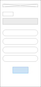
Fig. 1: Example of wireframe of Questionnaire page
For our FAITH App, our designers drafted two User Interface models for the Quality of Life (QoL) Questionnaire (Fig. 2). Then, we analyzed them in depth to refine and define the final prototype. The creation of low-fidelity mock-ups helps to identify visual strengths and weaknesses, facilitating the choice of the most effective structure.
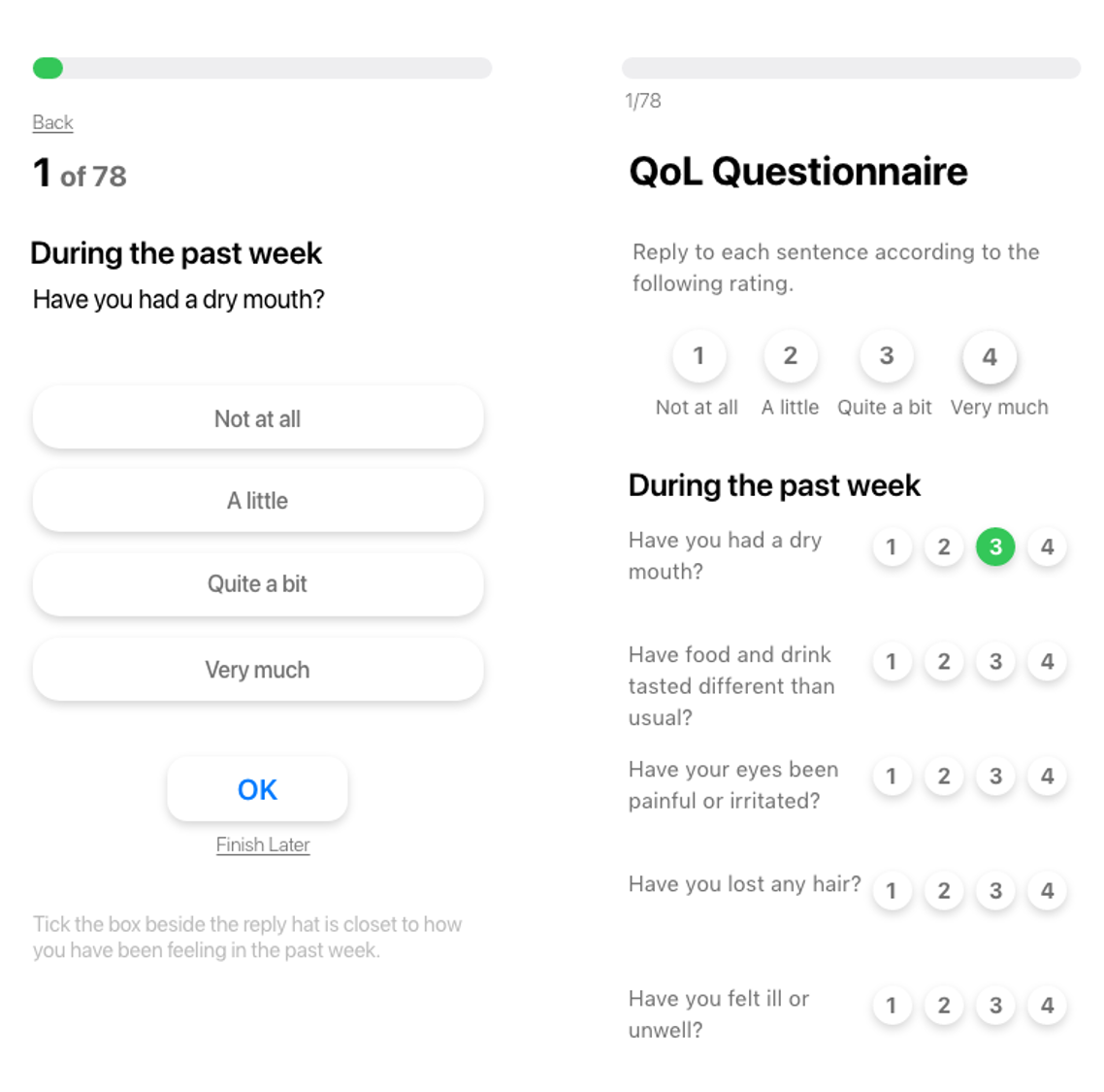
Fig. 2: Low fidelity mock-up of QoL Questionnaire page, Version A (left) and Version B (right)
Here, Version A displays one single question in each page, while Version B vertically aligns all the questions in a scrollable page.
The former provides a clear view of questions, but it can negatively affect the perception of required effort; the progress bar at the top of the page would grow very slowly; and the users would have to provide 2 clicks for each reply: one to select the entry, and a second to proceed to the next question. Users may perceive the experience of completing the questionnaire as strenuous and time-consuming.
Differently, the second UI prototype allows a faster, more efficient data entry process, resulting in a better user experience. For the disposition of this questionnaire, FAITH adopted this second visualization.
Later on, we proceeded towards a more mature fidelity mockup, applying the graphic style in the current definition (Fig. 3).

Fig. 3: High-fidelity mock-up of QoL Questionnaire page
Why is User Experience crucial to FAITH?
Designing our solution around the user experience, as shown in the example above, is pivotal for a number of reasons. The processes of information architecture creation, experience flow building and usability assessment are of fundamental importance to define a product that can meet the clinical requirements while being easy to adopt by the end-users.
From a design perspective, taking into account the accessibility and usability of the App enhances the user’s engagement, also improving the quality of data as a consequence.
From a user’s perspective, having to deal with a clean, stream-lined App with clear features and simple interface surely stimulates them to engage regularly with it.
Keeping the user at the centre
For its objectives, FAITH identified the construction of an AI model based on Federated Machine Learning as the best choice. Nonetheless, in order to achieve a data collection process that provides reliable data while building a smooth interaction with the user, several challenges lie ahead.
To test our methodology, the FAITH App will undergo a year-long trial process. During the trial, researchers will present breast and lung cancer patients and survivors with a beta version for them to test from a user perspective. Designing the App around the users is crucial to enhance its effectiveness and, overall, data quality; therefore, this principle is driving our current work as App designers.
Because user experience is crucial for our success, FAITH partnered with Deep Blue for their expertise in the field. Deep Blue specialises in research on user requirements and in designing user-centered solutions. Their experience will allow FAITH to better tune its needs with that of the users, keeping in mind the most important element of our project: cancer patients and survivors. Our main aim is, as always, to help them improve their quality of life, while living with and beyond cancer.
Authors: Ilaria Bonanno, Alessandro Tedeschi Gallo, Vera Ferraiuolo of Deep Blue (Rome, Italy).

